
The intent and purpose of this design is to convey a welcoming environment to the viewer about UC Photo Club. This was a personal project.
━━━━━━━━━━━━━━━━━━━━━━━━━━━━━━
UC Photo Club is a University of Cincinnati sanctioned club with the goal to welcome everyone who shares the love of photography no matter the persons expertise.
When taking over the role of social media strategist, I was heavily inspired by the old logo of the club(above) and saw many ways I could make the new logo(below) more effective while keeping the original aspects, this included adding the UC red, changing the font, and redesigning the camera with a geometric design.


━━━━━━━━━━━━━━━━━━━━━━━━━━━━━━
I started by identifying what I wanted and generating ideas on paper, writing small quips, themes or objects that are often associated with photography, and the atmosphere and energy surrounding the club.
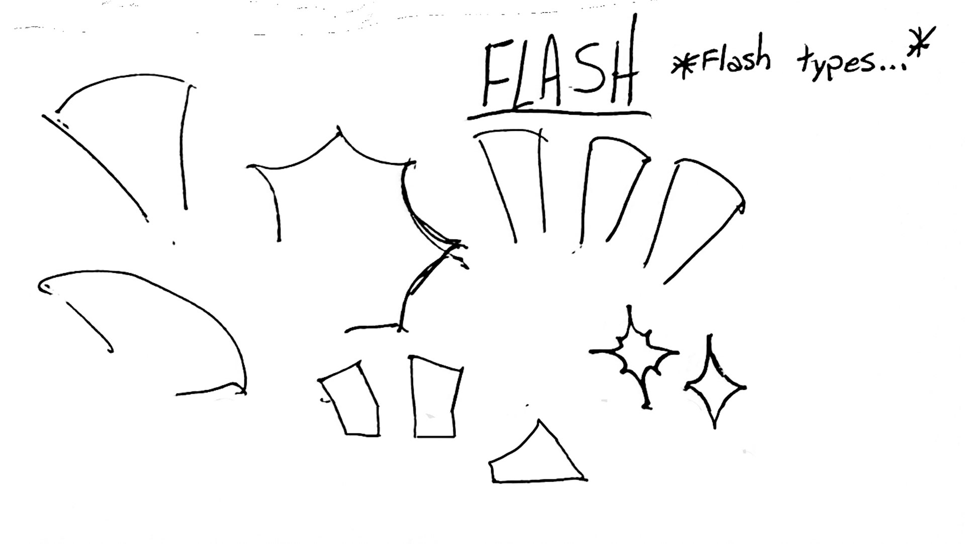
I delved into drawing the flash types for future camera iterations and drawing the logo of UC Photo Club as to keep the identifiable part near the beginning of the project.


━━━━━━━━━━━━━━━━━━━━━━━━━━━━━━━━━━━━━━━━
I started to focus my sketching towards some of the ideas, I made sure to note what I thought before, during and after my sketching so I could look back on my thoughts and progress as I go.
I decided pretty soon after that SD cards might not be the most identifiable part of photography and quickly ditched the idea.


━━━━━━━━━━━━━━━━━━━━━━━━━━━━━━━━━━━━━━━━
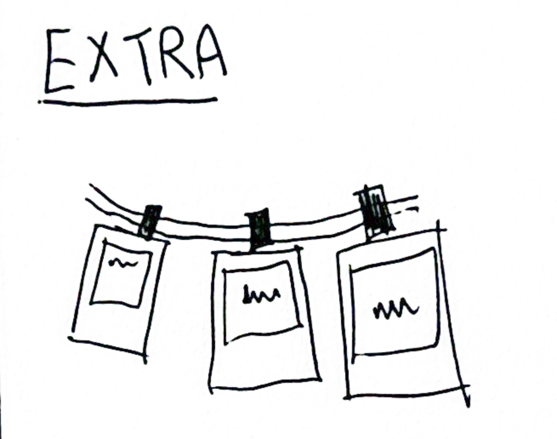
I realized that polaroids and photo strips, while more recognizable to do with photography, it would be difficult to include the UC Photo Club logo which was a necessity along with adding a small quip which I similarly felt was important.


━━━━━━━━━━━━━━━━━━━━━━━━━━━━━━━━━━━━━━━━
I transferred over to Figma to start designing the camera that would be the main part of the sticker.
Here I was having difficulty deciding black or red text and decided to keep both as an option for now.


━━━━━━━━━━━━━━━━━━━━━━━━━━━━━━━━━━━━━━━━
I moved on to the white outline, realized it made the design feel lost and quickly changed back.


━━━━━━━━━━━━━━━━━━━━━━━━━━━━━━━━━━━━━━━━
I noticed the UC Photo Club logo made the image look a little too busy and changed the camera lens to just include the UC portion.
I also decided to stick with the red color text.


━━━━━━━━━━━━━━━━━━━━━━━━━━━━━━━━━━━━━━━━
I chose the red version of the UC Photo club simpler design and moved to printing the stickers.

━━━━━━━━━━━━━━━━━━━━━━━━━━━━━━━━━━━━━━━━