
The intent and purpose of this design is to effectively communicate an event that highlights one of many local legends in the Cincinnati Area. The celebrity I chose was Steven Spielberg, an American filmmaker who grew up in Cincinnati.
━━━━━━━━━━━━━━━━━━━━━━━━━━━━━━━━━━━━━━━━
I started by playing with the physical type we needed to use in the poster, all required text was used in each of the iterations.
I drifted towards emphasizing "Cincinnati" around Steven Spielberg's name so perhaps passerby's would become curious and come up and read more about the information.


━━━━━━━━━━━━━━━━━━━━━━━━━━━━━━━━━━━━━━━━
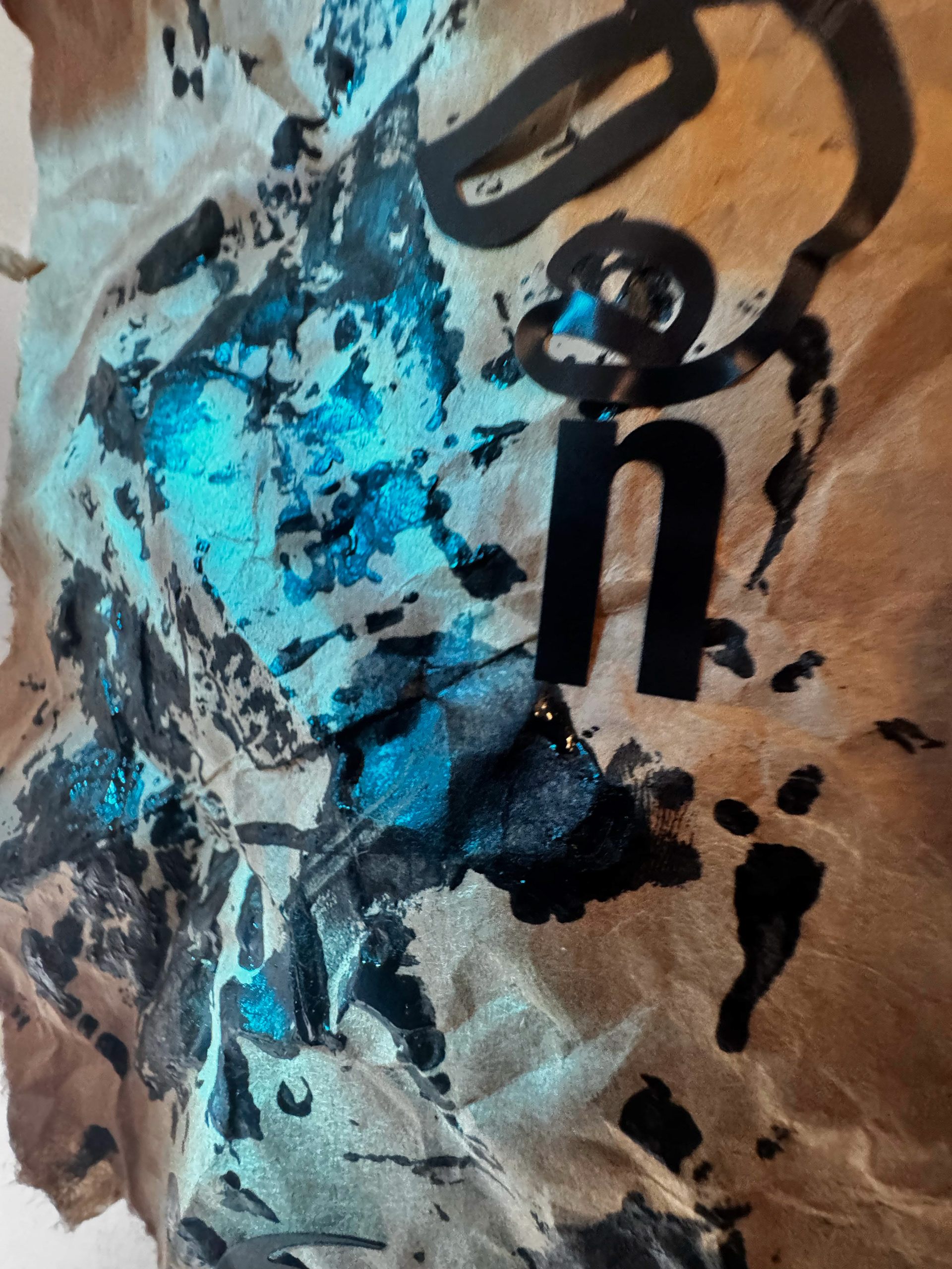
I started looking around and playing with physical characteristics to add to the poster.
I wanted to use a rod and a black shirt to look like a director chair, use black ink and letter stickers for an artistic take, and used the posters on the wall as inspiration for his movie posters. Each design centered back on Steven Spielberg.


━━━━━━━━━━━━━━━━━━━━━━━━━━━━━━━━━━━━━━━━
After getting ideas on how to progress different routes, I remade them to better suit Steven Spielberg.
I adjusted the camera to get a good dynamic angle on the rod.
I used the word star; a required text, and the black ink to bring back a more artistic view.
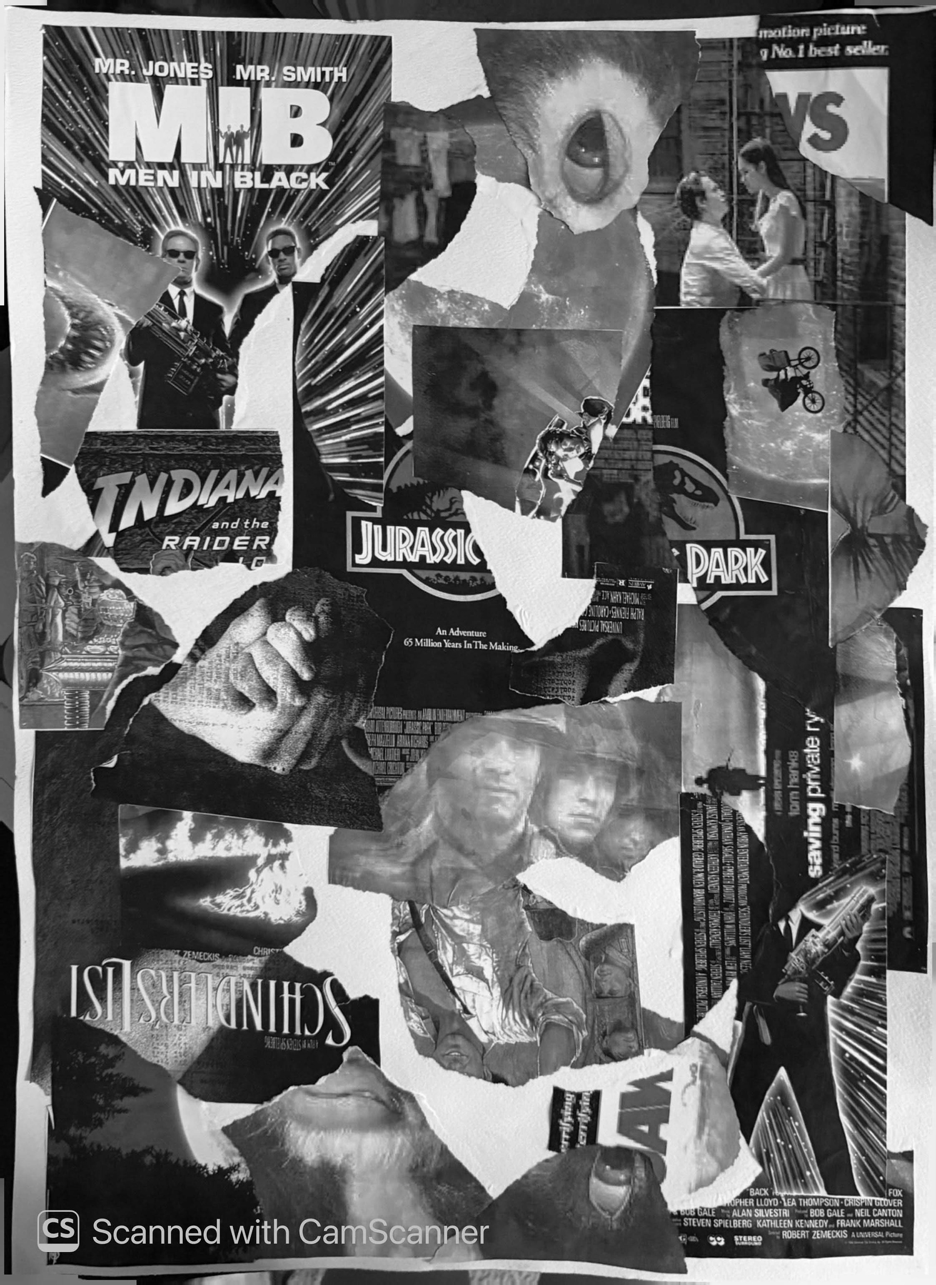
I cut up pieces of posters most noticeable as Steven Spielberg's more famous movies to get the similar style I saw with the previous posters.


━━━━━━━━━━━━━━━━━━━━━━━━━━━━━━━━━━━━━━━━
I put in basic text, added a color palette or did a mix of both to gather a strong feel for which direction I wanted to end up going with.
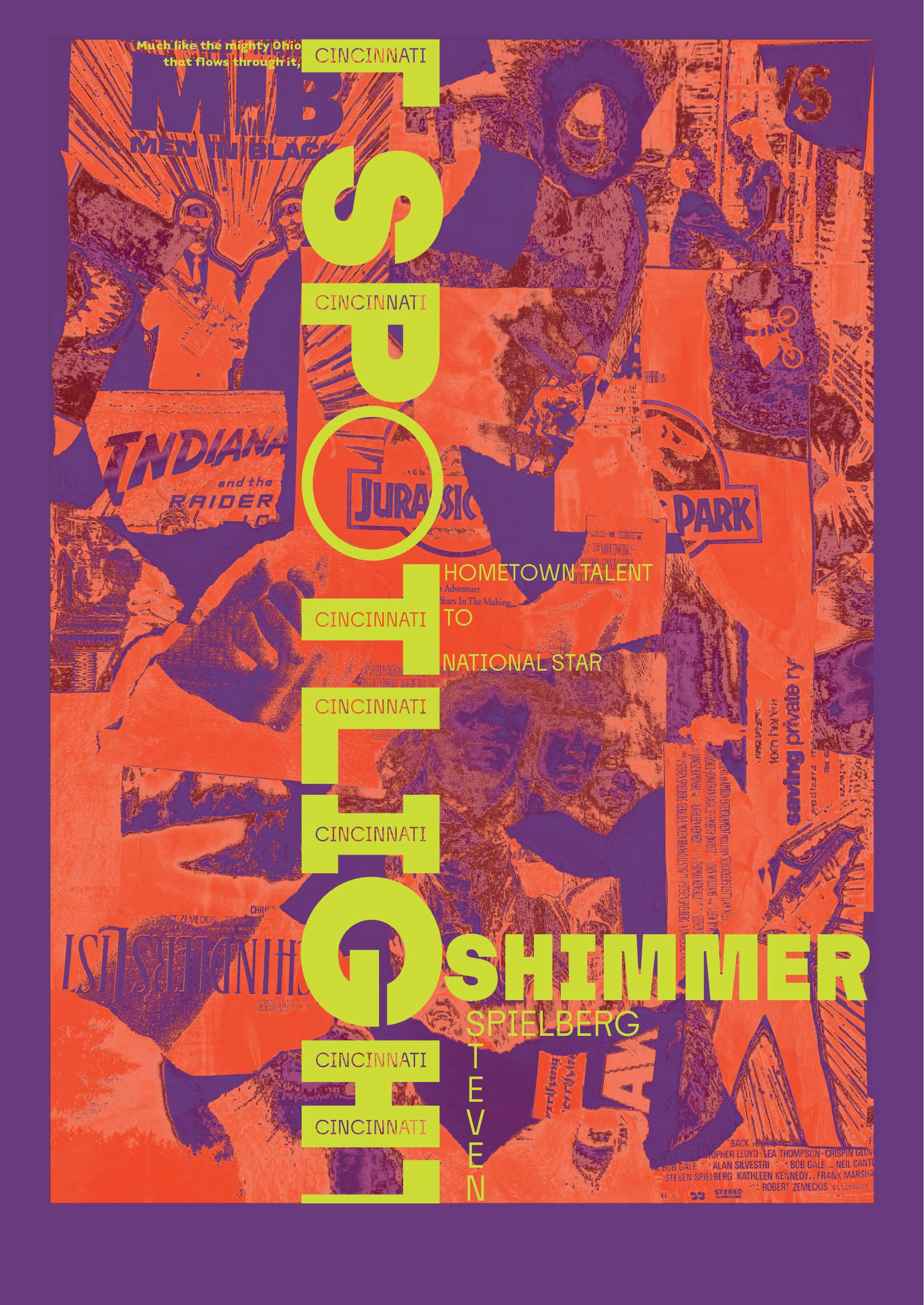
I eventually went with the collage of movie posters as I felt it was the most strong towards Steven Spielberg.


━━━━━━━━━━━━━━━━━━━━━━━━━━━━━━━━━━━━━━━━
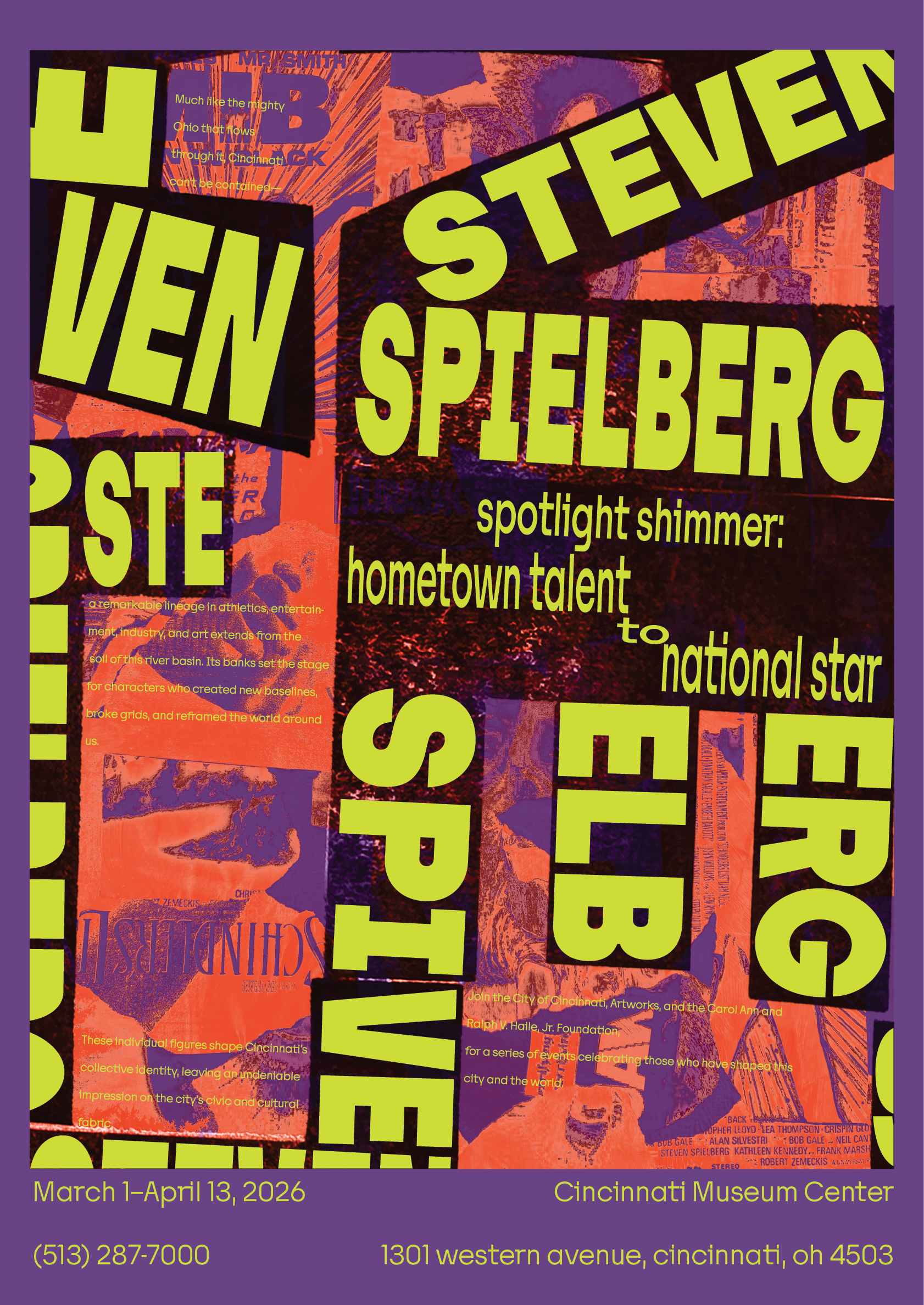
I created multiple iterations, using a previous mash up of the word "talent" or "star" to align the shout.
Similarly I moved the talk and whisper around the poster, eventually deciding the bottom one was better of the three.

━━━━━━━━━━━━━━━━━━━━━━━━━━━━━━━━━━━━━━━━
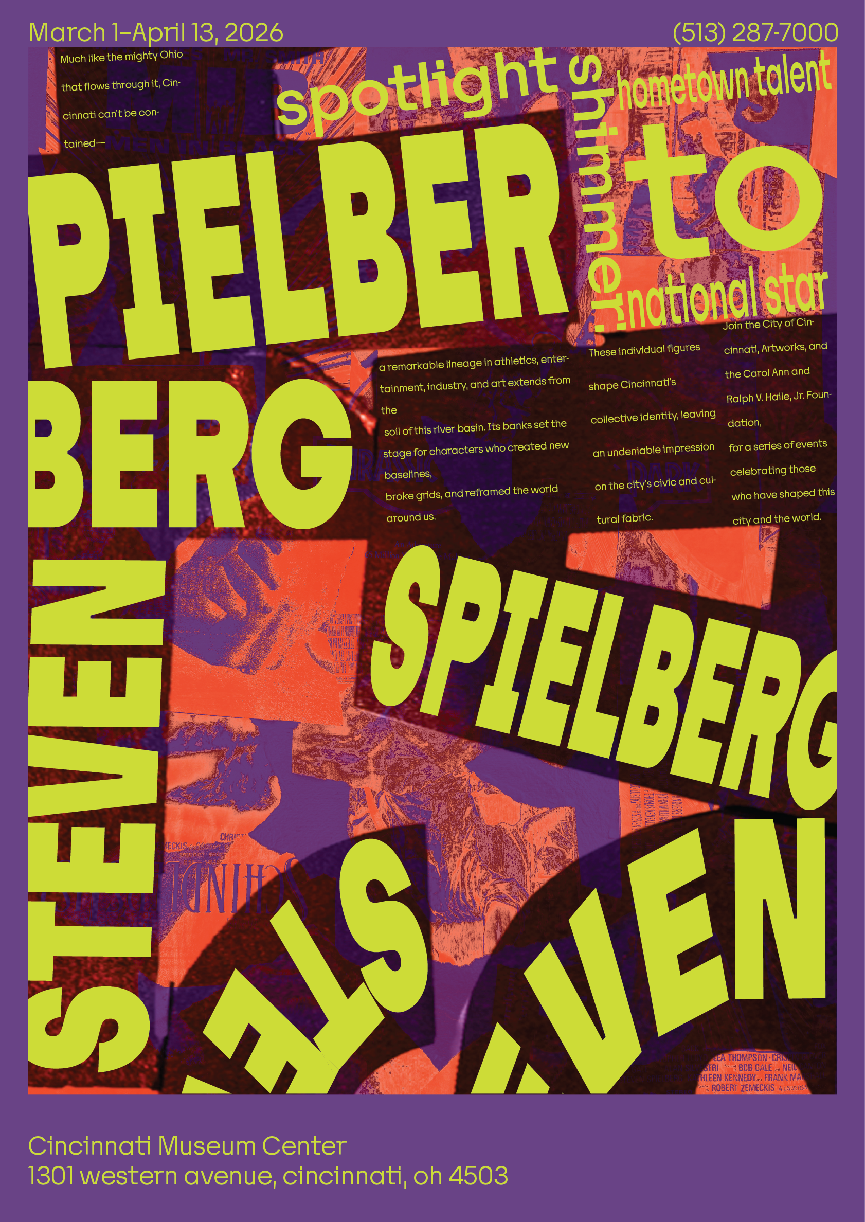
I decided to ultimately ditch the "talent" or "star" guides in the background as it felt too busy, deciding to go with an off set shout text, using the purple as a frame.
I felt the bottom one was the best option, calling back to the multi-use of "Cincinnati" to draw the viewer in.


━━━━━━━━━━━━━━━━━━━━━━━━━━━━━━━━━━━━━━━━
I moved onto adding the rest of the whisper, lining it up with the "Spotlight" in the middle of the poster, along with lining up the bottom whisper text with each other.

━━━━━━━━━━━━━━━━━━━━━━━━━━━━━━━━━━━━━━━━