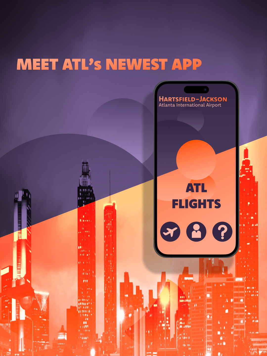
The Intent and purpose of this app was to focus on displaying accurate information about flights while adapting to the needs of families flying in and out of Atlanta International airport.
━━━━━━━━━━━━━━━━━━━━━━━━━━━━━━━━━━━━━━━━
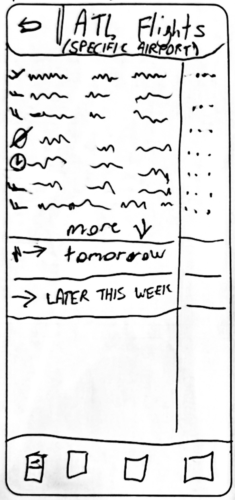
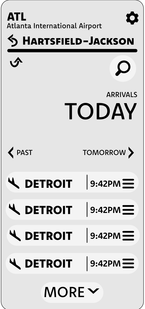
I sketched out the initial ideas for the arrivals / destination screen as it was the most important screen that the average user would be using.


━━━━━━━━━━━━━━━━━━━━━━━━━━━━━━━━━━━━━━━━
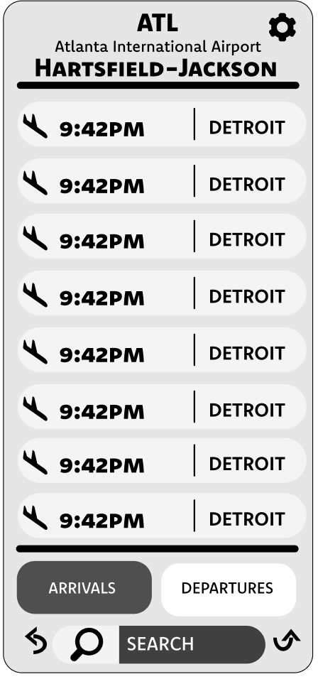
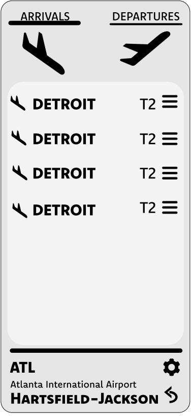
I made the sketches digitally on the computer, keeping an open mind through out my ideas and not limiting myself to just one.
━━━━━━━━━━━━━━━━━━━━━━━━━━━━━━━━━━━━━━━━
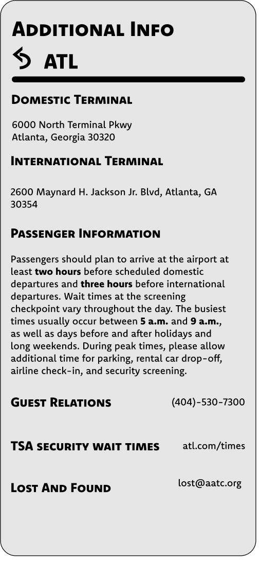
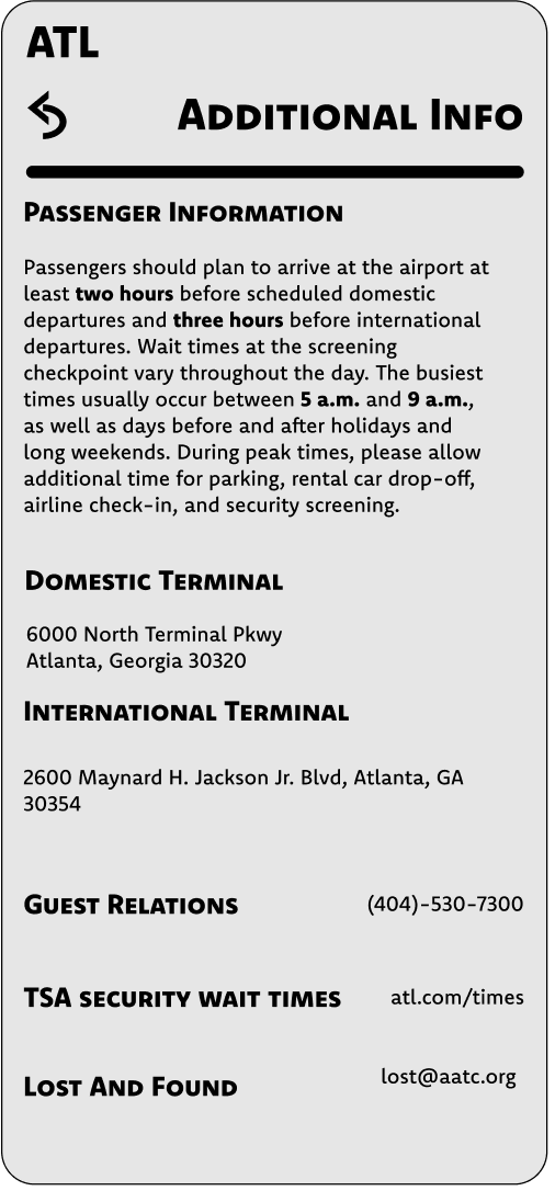
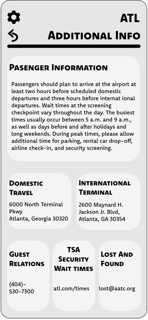
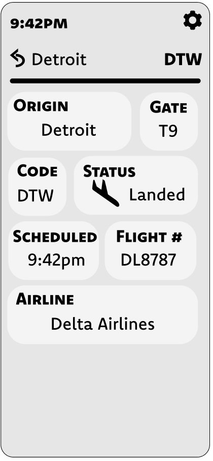
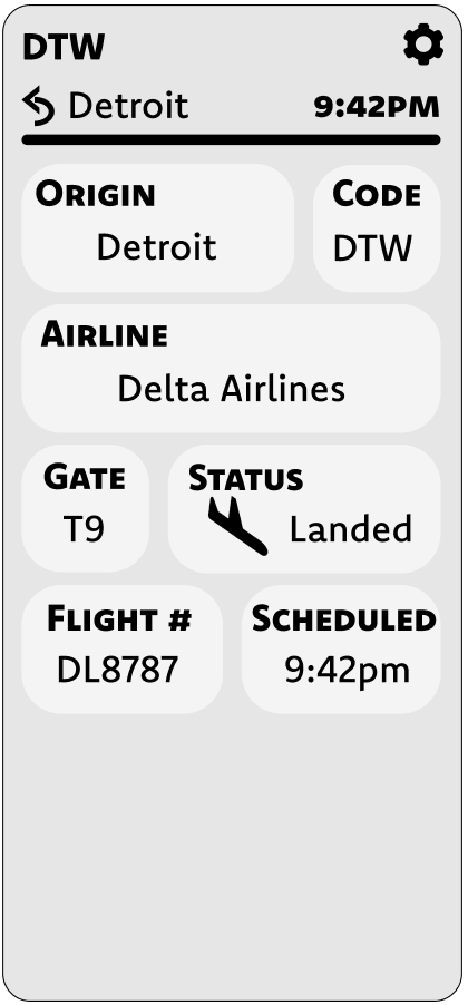
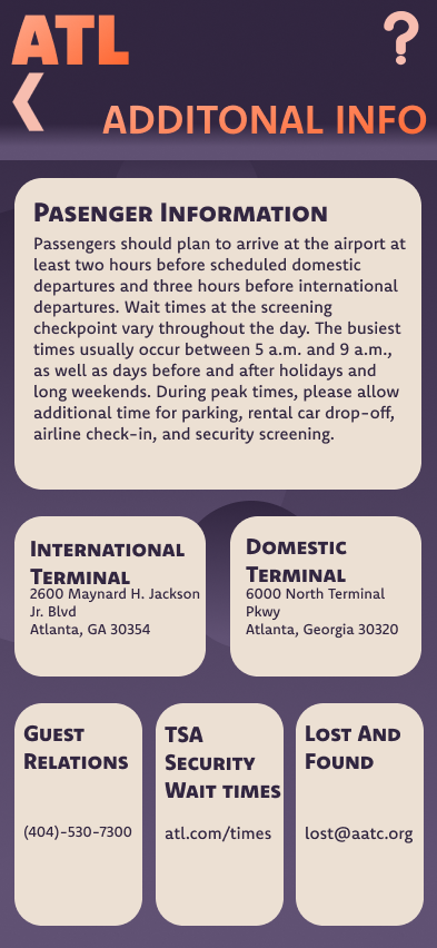
I then moved on to the additional information screen, experimenting with hierarchical studies, line weights, and spacing.
━━━━━━━━━━━━━━━━━━━━━━━━━━━━━━━━━━━━━━━━
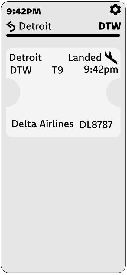
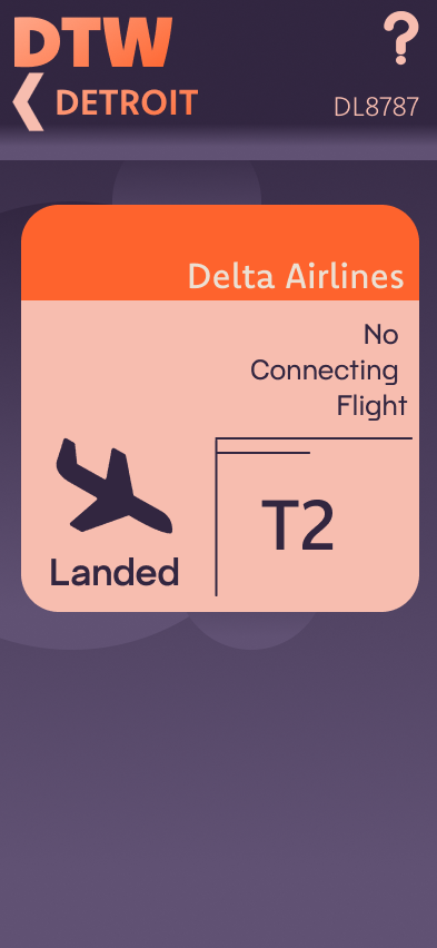
In similar fashion to the additional information, I continued exploring different hierarchical studies and styles while implementing my flight information screens into digital sketches.
━━━━━━━━━━━━━━━━━━━━━━━━━━━━━━━━━━━━━━━━
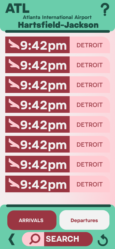
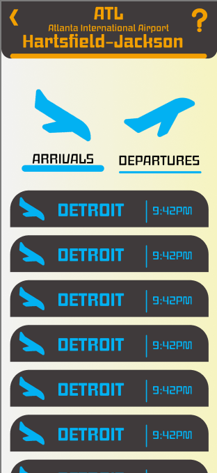
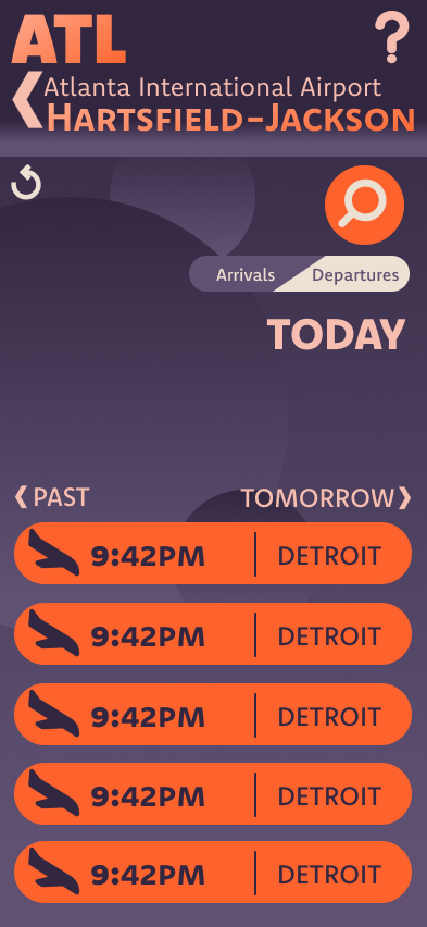
After deciding three directions to strengthen with fonts and a color palette, I emphasized the styles with strong iconography, contrasting colors, and visually distinct layouts.
━━━━━━━━━━━━━━━━━━━━━━━━━━━━━━━━━━━━━━━━
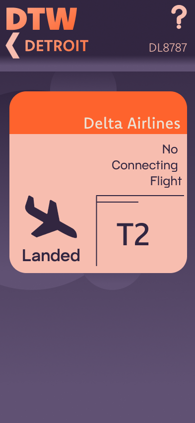
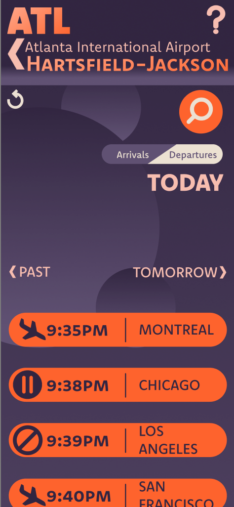
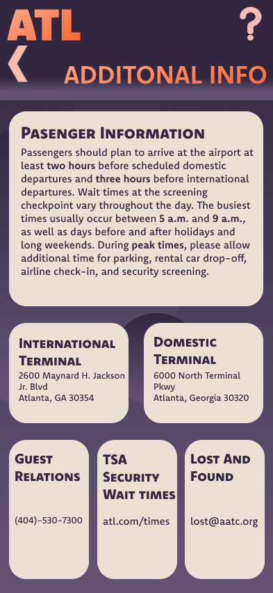
After choosing a final direction to finalize and iterate, I began designing finalizations of other required screens, including the additional information and the flight information screens.
━━━━━━━━━━━━━━━━━━━━━━━━━━━━━━━━━━━━━━━━
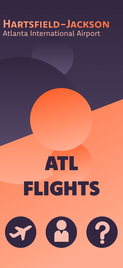
The ending results in a family friendly prototype app, designed to help guide family oriented users with any accommodations while being a streamlined and efficient app for fast paced scenarios.

━━━━━━━━━━━━━━━━━━━━━━━━━━━━━━━━━━━━━━━━